Label Placement in Forms
Published: July 12, 2006
“We were able to subject Luke’s theories to usability testing and enrich them through the power of numeric data.”
Please note that our ad-hoc test setup didn’t resemble real-world conditions. Since I had to properly measure saccadic activity and saccades times, I had to eliminate all elements that would force users to visually browse through the pages we used during testing.
We based our test setup on Luke Wroblewski’s article “
Web Application Form Design.”

Luke provided valuable insights and feedback during both our test preparation and results analysis. Thank you, Luke! Thus, we were able to subject Luke’s theories to usability testing and enrich them through the power of numeric data.
During the process of building the forms that we would test, we tried to respect Luke’s suggestions regarding the relationship between label placement and formatting and the type of form content—well-known data versus unfamiliar data that requires thought. Thus, you’ll find both types of data on each of the pages that we tested. To add some real-world flavor, we paired inputs fields for well-known data with other slightly more difficult form elements such as drop-down list boxes. Moreover, doing so helped us to confirm our previous findings about forms.
Our test subjects comprised both expert users—primarily designers and programmers, but also some usability experts—and novice users. We requested users to complete all of the forms that we presented to them. Our gaze-path recordings were complete once a user clicked the submit button.
Test 1: Left-Aligned Labels to the Left of Input Fields
“Excessive distances between some labels and their input fields forced users unnecessarily to take more time to interact visually with the form.”
This was the first case we tested, because it’s the most popular format in use on the Web. Not surprisingly, both classes of users performed very well in associating the label with the proper input field.
For all users, we found that there was a single saccade between the label and the input field, which means that users easily perceived the connection between them. However, a medium saccade duration of 500ms (milliseconds) was typical, which is quite long, showing that users were experiencing heavy cognitive loading.
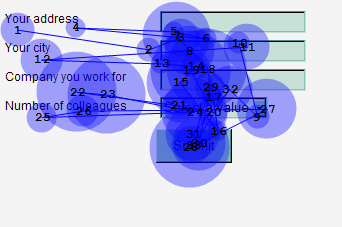
The whitespace between labels and their input fields worked well in visually guiding the users’ gaze path toward the input fields. In fact, there were no fixations over whitespace. However, excessive distances between some labels and their input fields forced users unnecessarily to take more time to interact visually with the form. Figure 1 shows the eyetracking data for this test.
Figure 1—Testing left-aligned labels to the left of input fields
Since we included a drop-down list box in the form, we also had the opportunity to confirm our previous
findings about them: that they are the most eye-catching form elements. When facing a simple form on a white page, the first fixation of
all users was on the drop-down list box. This form element clearly conveys its meaning and how a user must interact with it, giving it a higher importance in the user’s mind. Moreover, in our first test form, the item selected in the drop-down list showed just a number, with no reiteration of the meaning the label communicated. We found that most test subjects, including the expert users, were forced to recheck the label to remind themselves of the value of the numbers the drop-down list contained.
Test 2: Right-Aligned Labels to the Left of Input Fields
“The right alignment of the labels reduced the overall number of fixations by nearly half, showing that this layout greatly reduced the cognitive load required for users to complete the task.”
While the meaning of the labels and their placement to the left of the input fields was exactly as in the previous test, the right alignment of the labels reduced the overall number of fixations by nearly half, showing that this layout greatly reduced the cognitive load required for users to complete the task. Also, the form completion times were cut nearly in half.
There was almost no saccadic activity between the labels and their corresponding input fields, both because users very quickly understood the meaning of the input fields and because of the ease of the lateral eye movement.
While we had 500ms saccades with the left-aligned labels, with right-aligned labels, the saccade times between the labels and the input fields were only about 170ms for expert users and 240ms for novice users.
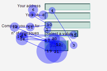
My initial concern with this particular form design was that it would be difficult for users to make the transition between typing their data into an input field and moving their eyes to the beginning of the next label, because its position was unpredictable. Well, I couldn’t have been more wrong. Their diagonal eye movements were very quick, and there was no need for them to reposition the fovea over the initial word, as the eyetracking data in Figure 2 shows.
Figure 2—Testing right-aligned labels to the left of input fields
Most users—both expert and novice—needed to recheck the input field’s corresponding label in this case, too—though the relative brevity of the saccades made this task slightly simpler than in the previous test.
Test 3: Left-Aligned Labels Above Input Fields
“Placing a label right over its input field permitted users to capture both elements with a single eye movement.”
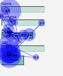
From the results of our second test, we knew that the nearer a label is to its input field, the more quickly users could move from the label to the input field. So, we were not surprised when we noticed that most of the fixations were right on the input fields rather than on the labels, as the eyetracking data in Figure 3 shows.
Figure 3—Testing left-aligned labels above input fields
Placing a label right over its input field permitted users to capture both elements with a single eye movement. Also, if a label indicated data that was very familiar to users—for example, their first name or family name—users did not fixate on the label separately to read it. They were able to view both the label and the input field in the same foveal area; thus eliminating the need for additional fixations and saccades.
Moreover, we measured shorter saccade times of just 50ms in cases where users did move from a label to its input field. Recall that, in the case of left-justified labels, the saccade times were nearly ten times as long. So, users were able to complete the form very quickly and with a reduced cognitive load.
After two test cases in which the drop-down list box proved to be the most prominent form element, I wanted to check whether its position would influence the results. Not at all. Independent of its position, it continued to attract users’ attention. In all cases, we found it to be, indeed, the most eye-catching form element. It’s more prominent than even the submit button.
I’d also like to point out that, in this case, none of the expert users needed to recheck the corresponding label; though some novice users did need to recheck the label.
Test 4: Bold Labels Above Input Fields
“In this layout [with labels above the input fields], it’s advisable to use bold fonts for input field labels. This increases their visual weight and brings them to the foreground of the layout.”—Luke Wroblewski
“Bold labels resulted in an almost sixty-percent increasein saccade time to move from the label to the input field.”
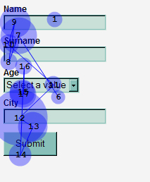
However, bold labels resulted in an almost sixty-percent increase in saccade time to move from the label to the input field—from 50ms without bold labels to 80ms with bold labels—with no apparent advantage from the more prominent labeling. Bold labels were more difficult for users to read and perceive—probably because there was more visual confusion between the bold text and the heavy adjacent borders of the input fields. Figure 4 shows the eyetracking data for this test.
Figure 4—Testing bold labels above input fields
I’ve reviewed these results with Luke, and we’ve agreed that the absence of any visual design on our test pages might have modified the impact of the bold labels. However, as I said at the beginning of this article, what we tested was performance in terms of time, or speed, which required the absence of any other visual noise, and the times we recorded for bold labels were fairly poor.
Conclusions
Some interesting guidelines arose from this brief analysis of our test results. Coupling the following guidelines with Luke Wroblewski’s form design guidelines will help you to build the best form possible in each different situation.
- Label position—Placing a label above an input field works better in most cases, because users aren’t forced to look separately at the labeland the input field. Be careful to visually separate the label for the next input field from the previous input field.
- Alignment of labels—In most cases, when placing labels to the left of input fields, using left-aligned labels imposes a heavy cognitive workload on users. Placing labels above input fields is preferable, but if you choose to place them to the left of input fields, at least make them right aligned.
- Bold labels—Reading bold labels is a little bit more difficult for users, so it’s preferable to use plain text labels. However, when using bold labels, you might want to style the input fields not to have heavy borders.
- Drop-down list boxes—Use them with care, because they’re so eye-catching. Either use them for important data or, when using them for less important data, place them well below more important input fields.
- Label placement for drop-down list boxes—To ensure users are immediately aware of what you’re asking for, instead of using a separate label, make the default value for a drop-down list box the label. This will work for very long lists of items, because a user already has the purpose of the input field in mind before the default value disappears.

Acknowledgement—I would like to thank Magda Giacintucci, of Consultechnology IMR, for her help, both in preparing the lab setup and conducting the tests.
- See more at: http://www.uxmatters.com/mt/archives/2006/07/label-placement-in-forms.php#sthash.SeHK1V1J.dpuf